G.E.P.A. is a platform dedicated to the medical attendance of patients with eating disorders by using online dashboards. The project consists of updating both the graphic identity and the dashboards.
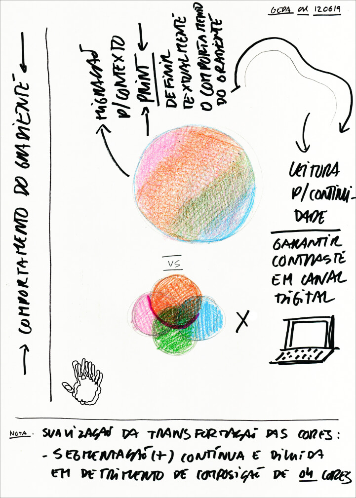
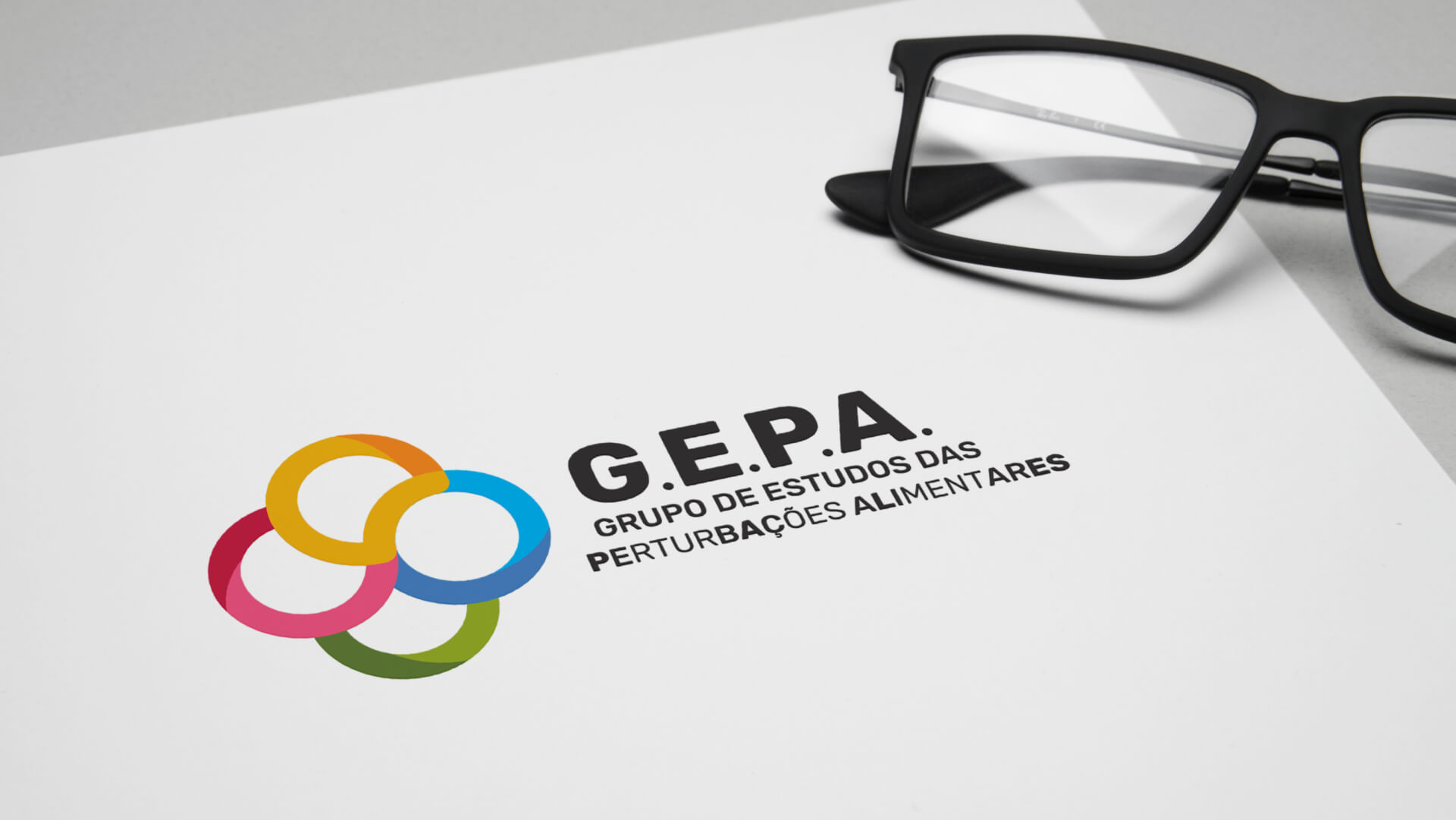
The conceptual starting point for this update is the idea of an information flux. The circular shapes that make up the logotype are simultaneously a graphic representation of the connections between researchers and patients and a reference to the previous version of the logotype, also based on the same circularity. One of the main influences while creating this identity was stupopium, one of studium's trends, which rethinks and analyses POP culture. With that in mind, the process of designing the logotype and its identity became more fluid and felt like a continuation of the work the studio had been developing during the previous months, assuring that not only the project was built on a set of solid principles, but it was also conceptually and graphically aligned with other projects, without ever losing its unique identity. Naturally, the graphic identity serves as a starting point for the restructuring of the dashboards, which follows the same graphic guidelines and unfolds them in a series of tools and usages, specifically related to the digital environment. It is a project that, by sharing a common toolkit, assures that all of its communication is coherent.

